
Welcome to Pulse //
From Prototype to Print: The Making of Pulse MVP
Our paper is finally here. Here’s an inside look at what makes it special
Pulse MVP’s design evolution balanced accessibility, aesthetics, and functionality.
Pulse
November 25, 2024
By Pulse Team
Creating the look and feel of Pulse MVP was a journey of thoughtful refinement, where each change brought us closer to the final product.
Throughout the prototyping process, we carefully implemented feedback and focused on making small adjustments that collectively made a big impact.
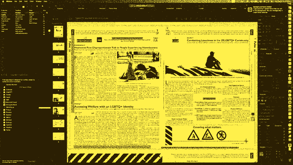
The first Pulse MVP prototype was just eight pages, compared to the 12 pages in the first issue. While the two versions may look similar at first glance, subtle design changes were made to enhance functionality, resulting in a more polished and reader-friendly publication.
Subtle Yet Significant Changes
These seemingly minor adjustments added up to an almost complete redesign—though, as with all good redesigns, the best changes feel invisible unless you look closely.
For example, the font size in the final product is noticeably larger—up to two points in some areas—based on reader feedback. This adjustment greatly improved accessibility, especially for readers with vision challenges. However, it came at the cost of reducing white space and compacting certain elements.

A two-page infographic anchors the heart of The Guide, presenting practical food resources in the debut issue.
Pulse
While this denser layout contrasts with contemporary design trends that favour open spaces, Pulse MVP’s compact format leaves little room for wasted real estate. Some readers even preferred this denser approach, saying it made the publication feel richer with content to explore.
By carefully balancing these priorities, we retained nearly all of the content while creating a design that feels both engaging and accessible.
Introducing The Guide
One of Pulse MVP’s standout features is The Guide—a themed, pull-out section offering practical, actionable resources.
The first edition of The Guide focuses on food insecurity, featuring money-saving grocery tips from Quinn Pulse Bot and essential information on accessing food banks.

The opening page to The Guide
Pulse
The layout of The Guide was carefully designed to be open and inviting, providing maximum information without overwhelming the reader.
It opens with an article on grocery shopping tips and transitions into a centre spread anchored by an infographic. Below the infographic, you’ll find a curated list of food programs in the area. The spread is bookended by an article on food banks, and the final page of The Guide features a map of hot meal locations in the community.

Early attempts at creating The Guide’s map.
Pulse
The goal was to create a practical resource that readers could detach and keep for future use. Early versions of The Guide explored alternative layouts, including placing the map on the infographic page or dedicating an entire page to it. Ultimately, we opted to use the final page of The Guide to create a compact and portable format.
Pulse MVP is a publication designed to evolve with each issue, building on the successes and lessons of the last. There’s much more to explore within its pages, and we hope you’ll pick up a copy to see it for yourself.
Featured
January 13
Readers Wanted.
We’re just getting started and need your feedback.
Check out our newsletter and website, then fill out our survey to help us improve!

